Bubble Sort Cutaway
Bubble sort at your pace
Bubble sort at your pace
Watch the algorithm converge...!
Dataframes on-the-fly
At times it is necessary to create dataframes within a program. Learn three ways to create them.

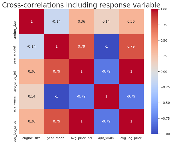
Improve the interpretation of a heatmap
Heatmaps are used to visually represent correlation between various continuous features in a dataset. You can construct heatmaps and give them different colours for different values. This gives good visual appeal and makes it easier to understand.
Correlate categorical predictor with continuous response variable
Regression datasets often have a mix of categorical and continuous predictor variables. When the number of categorical variables is large, how do you pick the ones that are relevant to the regression(i.e. correlated to the response variable)?
The convenience of horizontal histograms
Most NLP projects require us to look at word counts in documents. The traditional way is to draw histograms with vertical bars. But, are they convenient?