The Validation Curve
Tells you where to get off

Consider the typical use case of a boosted classification model such as Adaboost. Adaboost is known to overfit on noisy data. So, how do you determine how much boosting is too much boosting?
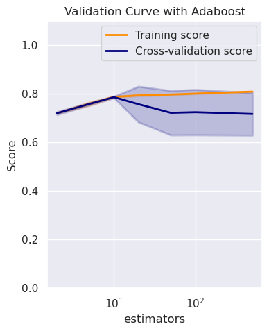
Enter the validation curve. The sklearn validation curve helps us plot the
training and the cross validation scores against a specified model parameter.
In our case, we vary n_estimators– the number of boosting base estimators.
The accompanying plot shows us that the training and validation curves diverge at about 10 boosting estimators. This indicates that our model would overfit if we went beyond this value.
Below is the source code fragment (adapted from the sklearn example) to generate the plot. To see the code in context, refer to this Kaggle notebook.
The validation curve is not to be confused with the learning curve which plots the training and validation scores against training sample size. The learning curve helps determine if an already ‘tuned’ model is overfitting.
|
|
The highlighted lines indicate how we sweep the n_estimators parameter across
a range of values to determine the point at which the training and validation
accuracies begin to diverge (and hence the model begins to overfit).